FARO
STRATEGY | BRANDING | DESIGN | PHOTOGRAPHY | SIGNAGE
We collaborated closely with Faro’s founding partners, two sisters based in India and the UK, to evolve their brand identity, reflecting their core values of craft, sustainability and vibrant living. Faro’s mission is to support artisan communities in India by creating ethically manufactured, authentic artisan products.
The project began with redefining Faro’s strategy to better communicate their commitment to ethical manufacturing and sustainable practices. This refreshed strategy aimed to broaden Faro’s appeal while maintaining authenticity.
The new visual identity draws inspiration from the peacock, a symbol of craft and refinement. The logo features the peacock’s iridescent eye-spot, with the centre shaped like the letter ‘O’ in Faro’s wordmark. The vibrant colour palette (peacock blue, marigold yellow, Jaipur pink and turquoise) reflects India’s rich cultural heritage.
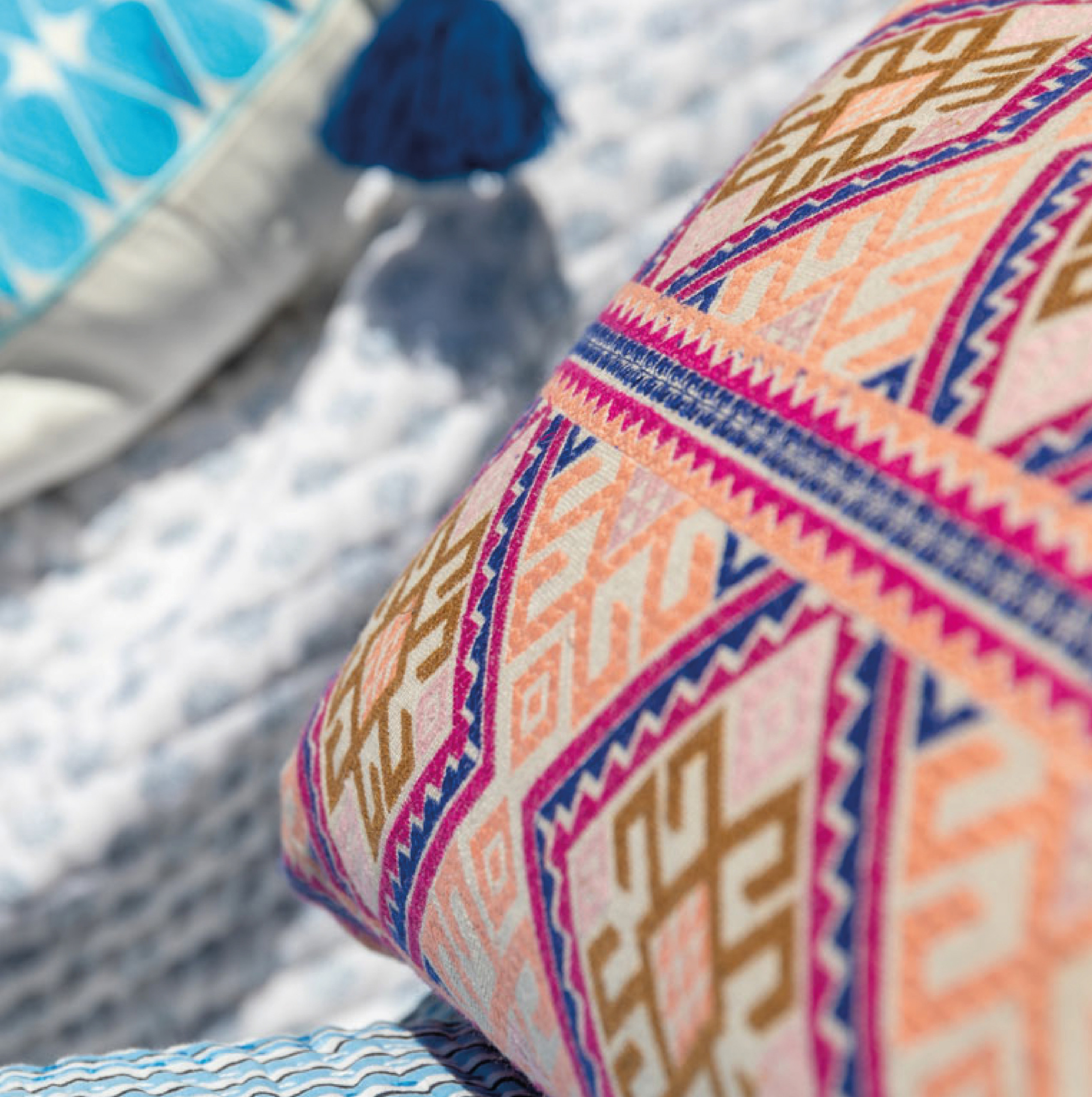
A comprehensive brand style guide was developed to ensure consistency across all touchpoints, covering typography, colours, photography style and tone of voice. We also created a photography library capturing the essence of Faro’s joyful lifestyle beyond product imagery.
Sustainability was central, with FSC-certified paper, eco-friendly inks and reusable packaging specified throughout collateral. The refreshed identity was applied across stationery, digital, print, and signage, positioning Faro as a quality brand rooted in ethical values.
“Wendy and Tim have exceeded our expectations, helped evolve our brand identity with creativity, and professionalism and we were blown away by the results! Thank you for a fantastic job and very well done indeed!”
Farheen Allsopp, Founding Partner at Faro