Orwell Lady
BRANDING | DESIGN | WEBSITE | PHOTOGRAPHY
To celebrate its 25th anniversary, Orwell Lady, a family-owned river trip business, sought to refresh its brand identity and enhance customer engagement. They partnered with us to lead a rebrand.
Our process began with a discovery phase including a brand audit, competitor analysis and market research, uncovering confusion caused by dual branding under Orwell River Cruises Ltd. We recommended consolidating the brand as Orwell Lady to improve recognition, especially in signage and online traffic.
The repositioning shifted focus from the boat itself to the experience, adopting the tagline “Join us on the River” and replacing “cruise” with the more approachable “River Trips.” We developed a warm, authentic brand identity featuring elegant typography, a subtle water ripple motif and nostalgic storybook-style illustrations highlighting the unique landscapes along the river.
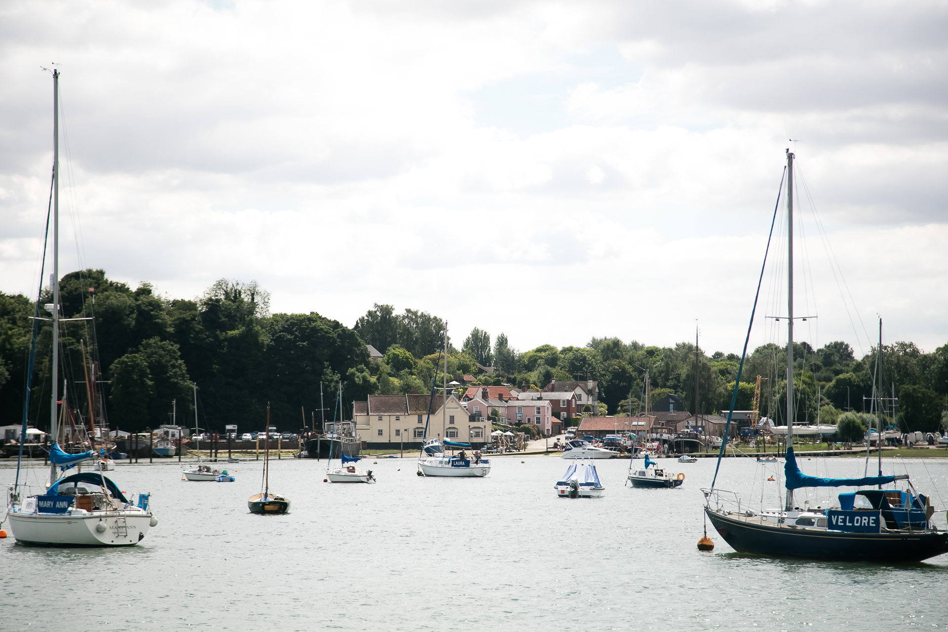
Our photography played a key role in capturing the essence of the experience, and a collaborative film project featuring drone footage of the river’s scenic journey bought the experience to life.
The redesigned website integrated the existing booking system with an enhanced user experience, making it easier for customers to explore and book trips.
Results include a revitalised brand that honours Orwell Lady’s heritage and drives future growth, along with an uplift in sales and renewed passion from the owners.
We asked Wendy and Tim to evolve our branding after 20 years in business. We were worried we had become a bit stale and we wanted to come out of the pandemic with a new look and feel. We were not prepared for the incredible lift they gave us – their holistic approach led us to not only fall back in love with the experiences we offer, but also to think about what we say and what we do. We have seen an uplift in sales since our new website, and they have helped us with everything from photography to marketing. Really recommended.
Emma Lightfoot