Penrose Learning Trust
STRATEGY | NAMING | BRAND IDENTITY | DESIGN
As a branding agency, our collaboration with the Penrose Learning Trust in their renaming/rebranding journey has been extremely rewarding. It’s always great to be involved right from the beginning. Through our holistic approach that blends strategic thinking, creative design, and sustainability principles, we’ve helped Penrose Learning Trust reimagine its identity for the future.
The Challenge
South Suffolk Learning Trust (SSLT) approached us to create a new name, brand identity and design collateral for their Multi Academy Trust (MAT). Their existing name was limiting their geographic growth and their identity no longer represented who they were and their vision for the future. They aimed to attract new schools while maintaining a sense of connection and appreciation among existing institutions.
“It has been an amazing experience working with Wendy and Tim from WHAT associates. They understood our organisation and developed a brand that supports us into the future. Our name links to our curriculum while providing inspiration to all our pupils. We are delighted with their work and we can’t thank them enough.”
Sarah Skinner, CEO Penrose Learning Trust
Phase 1: Discovery
Changing a name is a delicate process that requires careful consideration and planning. To understand the Trust’s aspirations and perceptions, we conducted focus groups, online questionnaires, and comprehensive research involving stakeholders such as the management team, board of directors, head teachers, governors, staff, students, and parents. This phase also included competitor analysis and a brand audit to identify opportunities for differentiation in the crowded marketplace. Collaborative involvement from the start was key to the success and adoption of this new name and brand identity.
Phase 2: Strategy and Naming
Based on insights from the discovery phase, we developed a strategy to foster collaboration, celebrate academic achievement, and ensure individual school identities within the trust. The naming process involved careful consideration and stakeholder involvement, resulting in the unanimous selection of “Penrose Learning Trust.” The name drew inspiration from mathematics, investigation, and the trust’s geographic roots.
Brand Identity
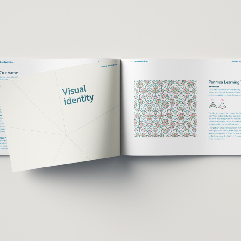
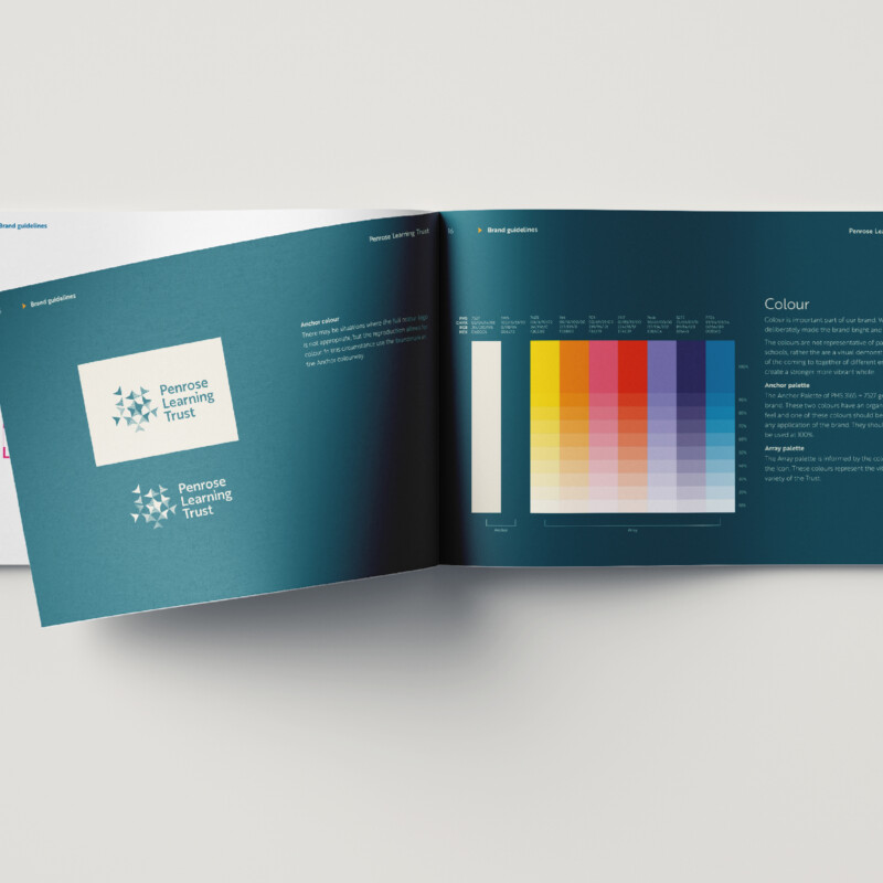
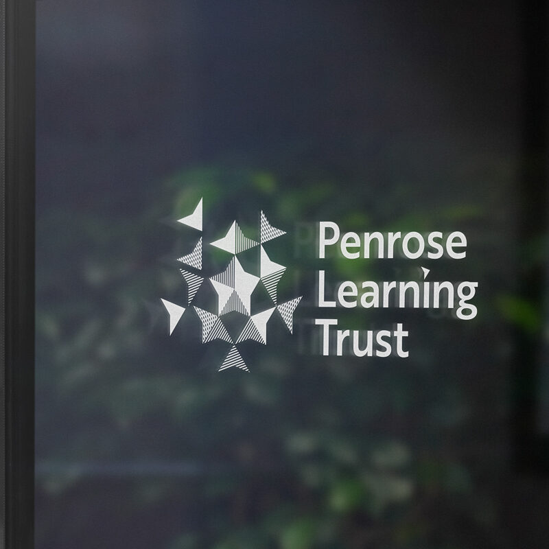
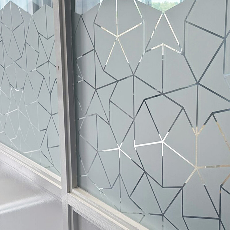
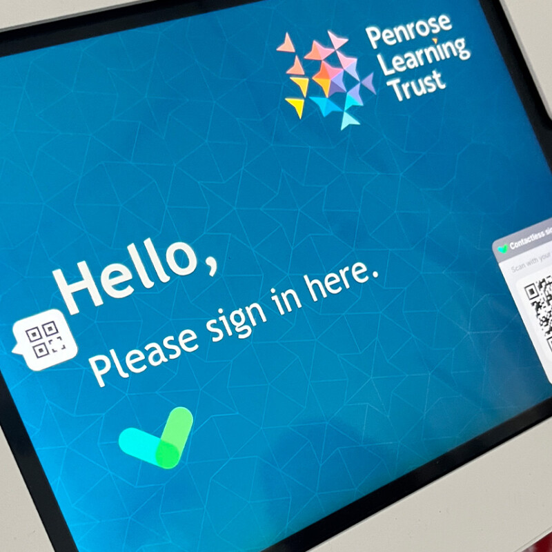
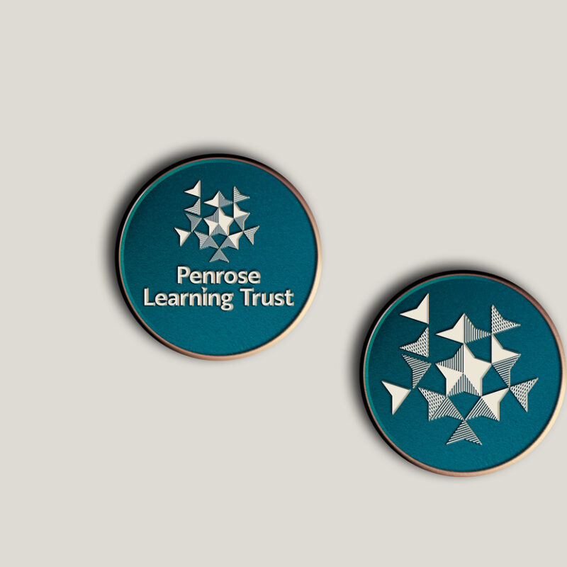
The brand identity draws inspiration from Penrose Tilings, symbolising growth and collaboration. The logo features tessellating patterns and vibrant colours, representing the unique contributions of each school within the trust. Typography and colour palette were carefully selected for their legibility and inclusivity across various mediums.
Messaging Architecture
In addition to visual identity, we developed messaging architecture and verbal identity guidelines to ensure consistent communication aligned with Penrose’s values. These guidelines serve as a foundation for maintaining coherence in messaging across all touch points.
Phase 3: Design and Sustainability
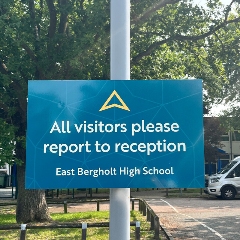
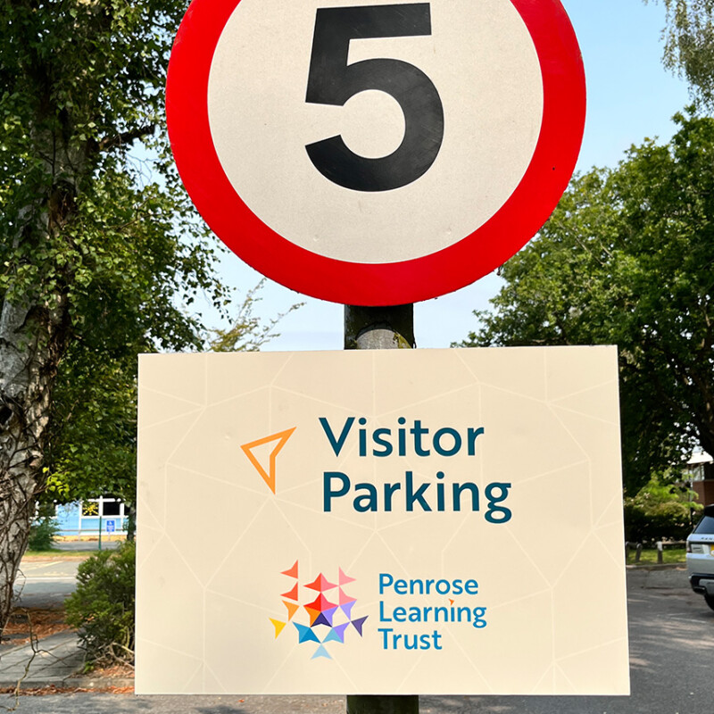
Sustainability was a core consideration in design decisions, focusing on utilising recycled and biodegradable materials for printed materials, signage, and promotional items. Existing signage structures were repurposed and refurbished to align with Penrose’s commitment to environmental responsibility.
Sustainability is a key consideration for us.
We have worked closely with our suppliers and manufacturers to make good decisions based on material selection, longevity, and function.
- Lanyards made from recycled plastic bottles (PET bottles) and biodegradable portrait card holders
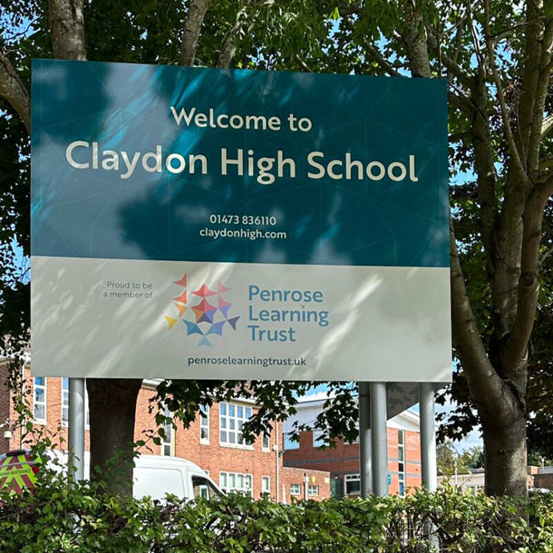
- We have chosen to repurpose and refurbish existing signage structures and ensure composite signage materials were specified which were recyclable while also being fit for purpose and strong to ensure longevity
- Each school within the Trust now displays a Penrose plaque which is 100% recyclable stainless steel.
- Main school signage displays the Trust brand identity and school name. A deliberate decision was made to not include individual school logos as these may evolve. This ensures the signage is a permanent fixture.
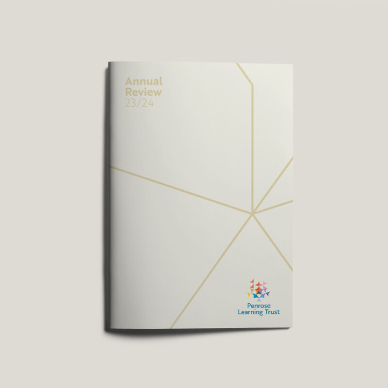
- Recyclable, recycled, and sustainable materials were used as a preference for all printed materials Penrose-branded items were shared across the MAT to reduce costs and create consistency across the board. Marketing, Stationary, Presentation templates, Prospectus, Newsletters, Lanyards and Signage.
- We worked with Penrose Learning Trust and their preferred 3rd party website partner to ensure the identity was on-brand.
Photography
We work with Penrose Learning Trust to curate a cohesive image bank, ensuring consistency in visual representation across all communication channels.
Next Steps
Our partnership with Penrose Learning Trust continues as we support them in implementing and evolving their new identity across all touchpoints, including website, signage, and marketing materials for all schools.