Pizza Electric

NAMING | BRANDING | DESIGN | PACKAGING | UNIFORM | MERCHANDISE

Alexander Troullier first contacted us when he was in the process of building his first Pizza restaurant in Hamburg. His vision was an 80s theme restaurant but he needed help with the concept: naming, brand strategy and design.

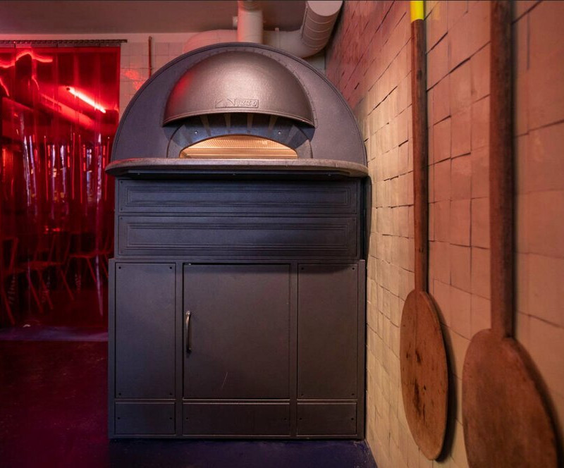
Working alongside Alexander and his architects, we saw an opportunity to elevate the brand story by focussing on something that had been highlighted by the planning department. They would have to install an electric oven rather than a traditional wood-fired pizza oven based on their residential location. 

The branding concept put sustainability at the heart of Pizza Electric’s ethos, with their pioneering electric pizza oven rivalling the quality of a traditional pizza oven. We used the concept of Electric to inspire creative and practical decisions throughout the project. Pizza Electric is powered only by green electricity and eco delivery methods were initiated including e-mopeds, electric cars, e-bikes and bicycles. All packaging was designed to be recyclable, reusable and sustainably made. All uniform was created using eco-friendly methods, screen printed eco inks and recyclable materials. 

CASE STUDY

THE NAME
Pizza Electric is an energetic and vibrant name. It’s simple, powerful, memorable. It reflects the logic behind the business, city-friendly electric ovens, electric bike delivery, dynamic and new concept. Experiential pickup, hang out, take away.

THE VIBE
Fun – but they take food very seriously, it’s all very tasty!
Environmentally conscious – but not worthy! (Electric bikes. Recycled packaging, Low food waste, sustainability…)

BRAND IDENTITY AESTHETICS

  • A playful identity for an 80s inspired pizza chain
  • High Visual and aesthetic
  • Modern, fun and irreverent
  • Brimming with personality

BRANDING
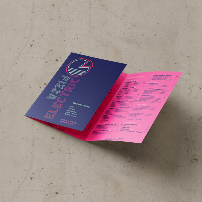
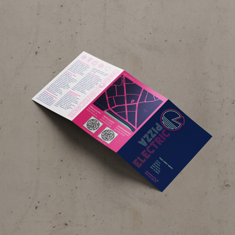
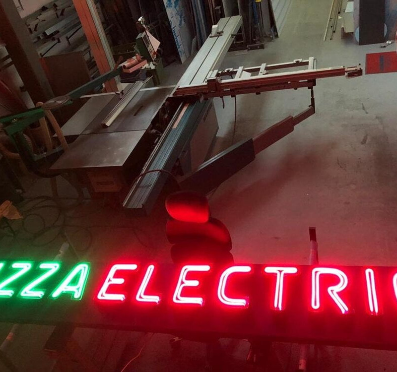
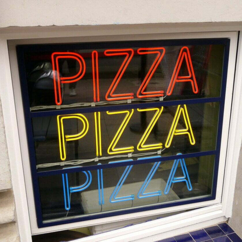
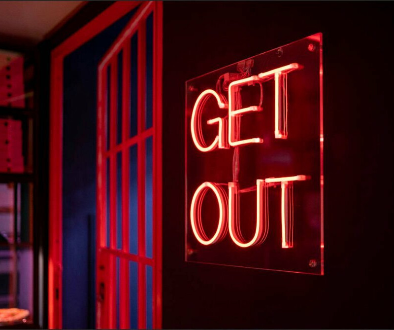
Brand mark, typography reminiscent of Neon tubes. Neon featured greatly in the interiors and exteriors of Pizza Electric. We worked closely with architects Box9 to create a cohesive scheme across brand, design and interiors. 

COLOUR 
Palette of fluorescent colours to define the brand as fun, energetic and vibrant.

The Interior scheme has accents of red interwoven. Red alone in print and digital looks flat so we have
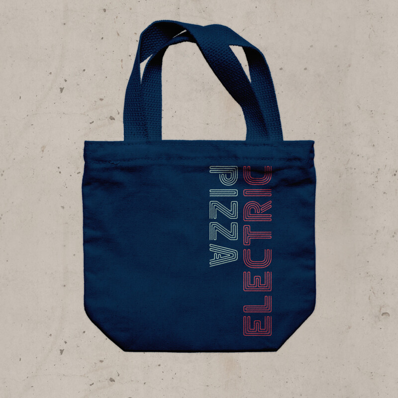
introduced a gradient to the word Electric which works to mimic neon and look energetic.

ICONOGRAPHY
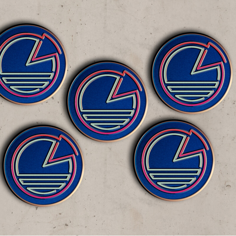
Designed to echo the line quality of the neon type the icon is connected to our typography at a fundamental level to maximise recognition and own-ability. The icon will appear in neon and guide customers to Pizza Electric.

A range of icons have been designed to communicate quickly and effectively across all touch points (from product to environment to marketing).  They bring with them a sense of fun and 80’s vibe, providing personality and character to the brand. Icon usage across digital platforms, pattern, packaging, badges and promotional items. 

SIGNAGE
Working with the architects Box9 we designed illuminated neon signage for the exterior and interiors.

PACKAGING
The design of all packaging, uniforms and merchandise for Pizza Electric is as recyclable and a sustainable as possible.

Sustainable packaging is a high priority for us, our clients and their customers in turn.

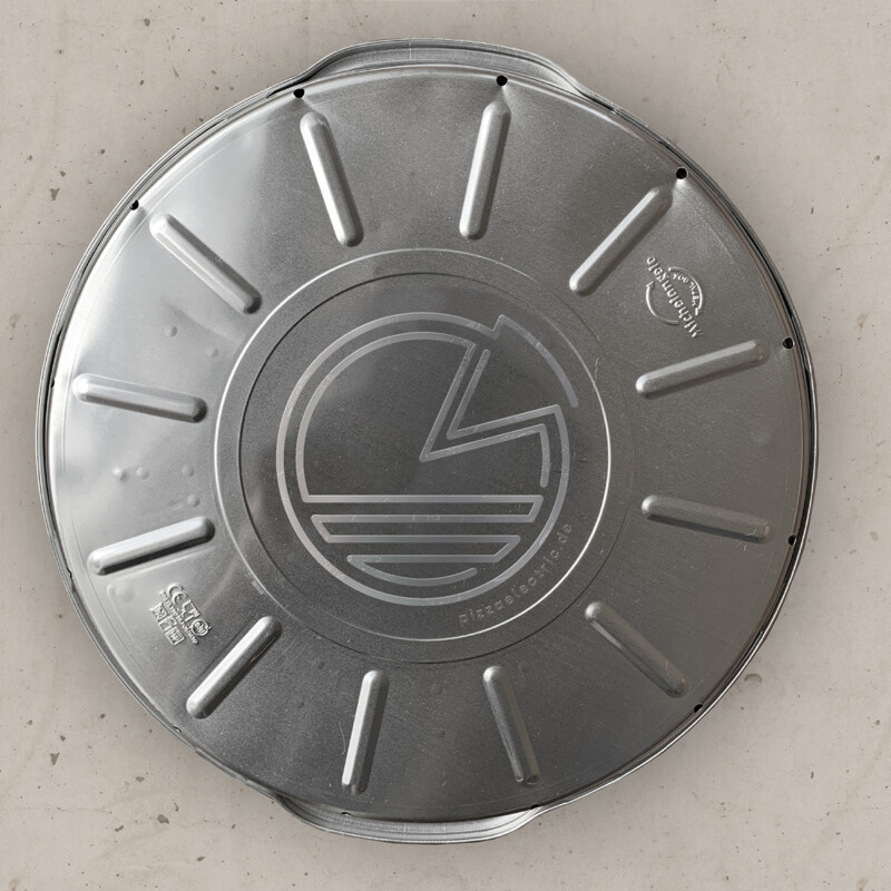
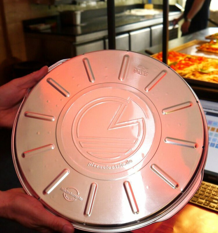
We have sourced and designed packaging which includes reusable aluminium pizza tins, which keep the pizza hotter for longer and retain the great taste and texture. The tins can be used to store leftovers and reheat in the oven and customers are encouraged to return and re-use the tins time after time. We also designed and specified CO2-neutral environmentally friendly packaging and print material.

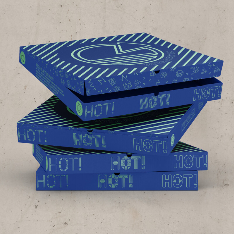
  • Compostable Kraft Pizza Box
  • Customised reusable pizza tins made with aluminium – The reusable tins mean the pizzas stay warmer for longer thanks to the conductivity of aluminium and taste better too. The tins are made from recycled aluminium. We spent weeks reattaching the best performing sustainable packaging for pizzas working with the Pizza chefs to test and evaluate the options. Made in Italy, the pizza tins are customised to feature the banding.  
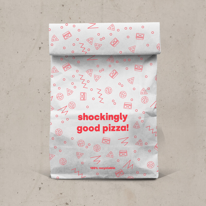
  • Kraft paper (recyclable) American style shoppers, pizza slice wax wrap, napkins

MERCHANDISE

  • Eco stickers, recycled stock and eco friendly inks
  • Bags for life – organic cotton and  screen printed with eco friendly inks
  • Enamel Pin Badges 
  • Organic Cotton screen-printed T-shirts for kids and adult

UNIFORM 
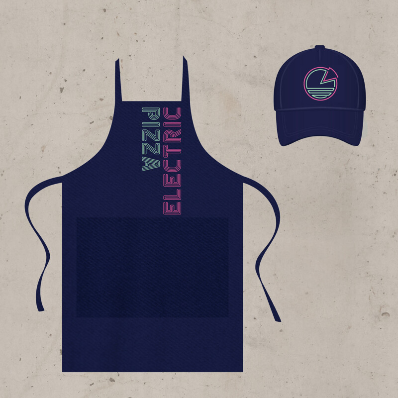
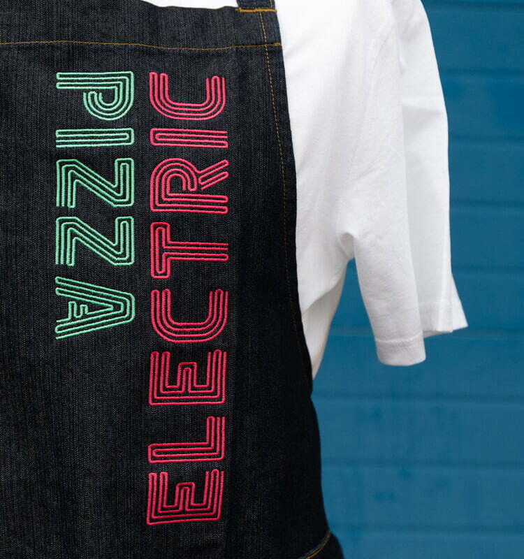
Uniforms were designed with sustainability in mind, eco-friendly screen-printed T-shirt’s, embroidered caps and denim aprons for longevity.

  • Organic Cotton screen-printed T-shirts for kids and adults
  • Uniform; recycled cotton caps, screen printed 100% organic t-shirts and Embroidered denim aprons ( hardwearing and longevity is key!)

Client: @pizzaelectric
Photography with kind permission: @pooya.photography @pizzaelectric
Uniform:@hudsongroupltd
Architecture & interiors @box9design