HERD Exclusive Networking
STRATEGY | NAMING | BRAND IDENTITY |
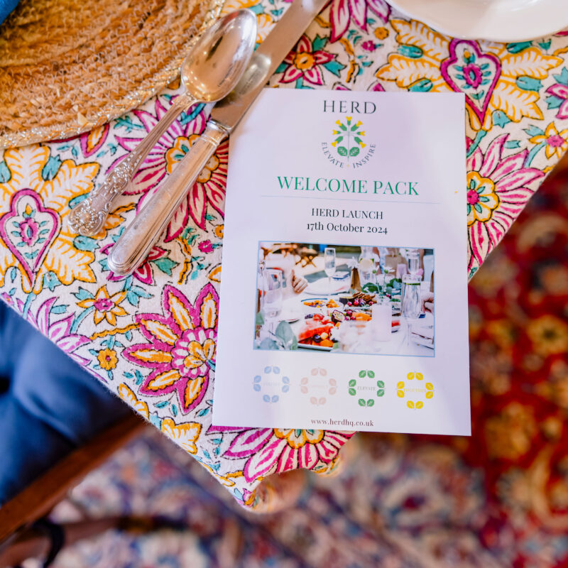
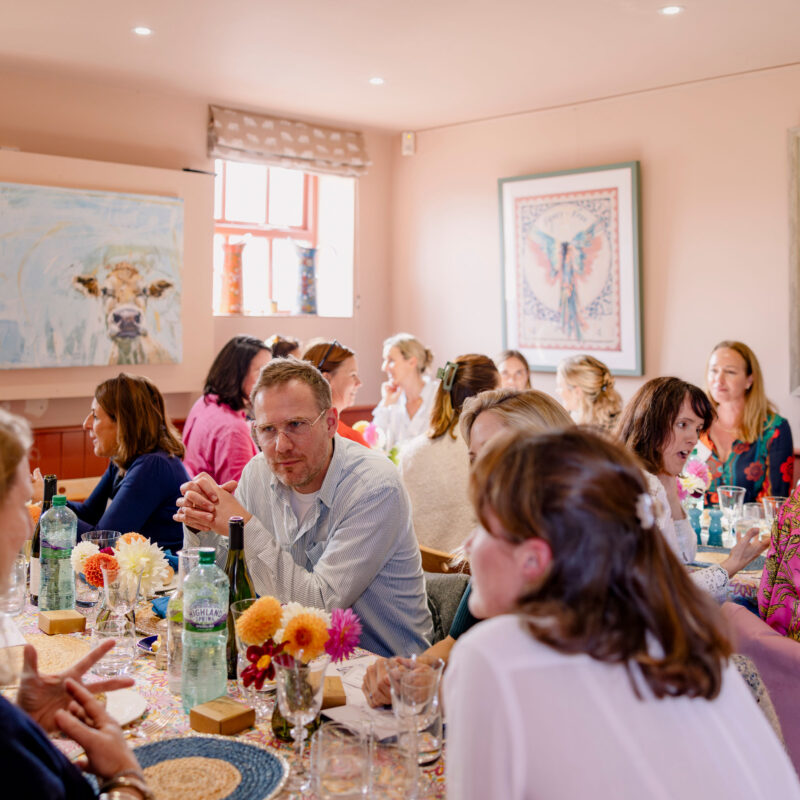
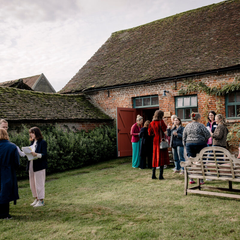
Kats Scott came to us with a vision: to create a networking community that felt nothing like traditional networking. HERD is a space for professional, like-minded individuals to connect, share ideas and grow all in a warm, relaxed environment with inspiring speakers and seasonal lunches held at The Cowshed.
The name “HERD” was key. It nods to the venue while symbolising unity and support. Like animals in a herd, members find confidence and safety in numbers. Naming is never just about sounding good, it’s about meaning something, being memorable and creating stand-out.
Visually, we aimed to reflect the rural charm of Suffolk. The cowslip is a flower native to Suffolk; it became our core symbol, representing growth and community. We created a clean, geometric brand mark to add modernity and distinction.
The brand identity includes a fresh, vibrant colour palette drawn from the local countryside, bold type and custom graphics to bring clarity and warmth to all communications. The result is a brand that’s professional yet personal, perfect for Kats’ intentions.
“I’ve enjoyed the experience of working with WHAT. They have listened to me and I think may have told my story more clearly than I could have done myself. I love the name. The new identity perfectly captures the spirit of HERD. It’s modern, memorable, and aligns with our vision of a supportive and inspiring environment.
Kats Scott
Photography credit: Lucy J Toms Photography from the Herd Launch event.