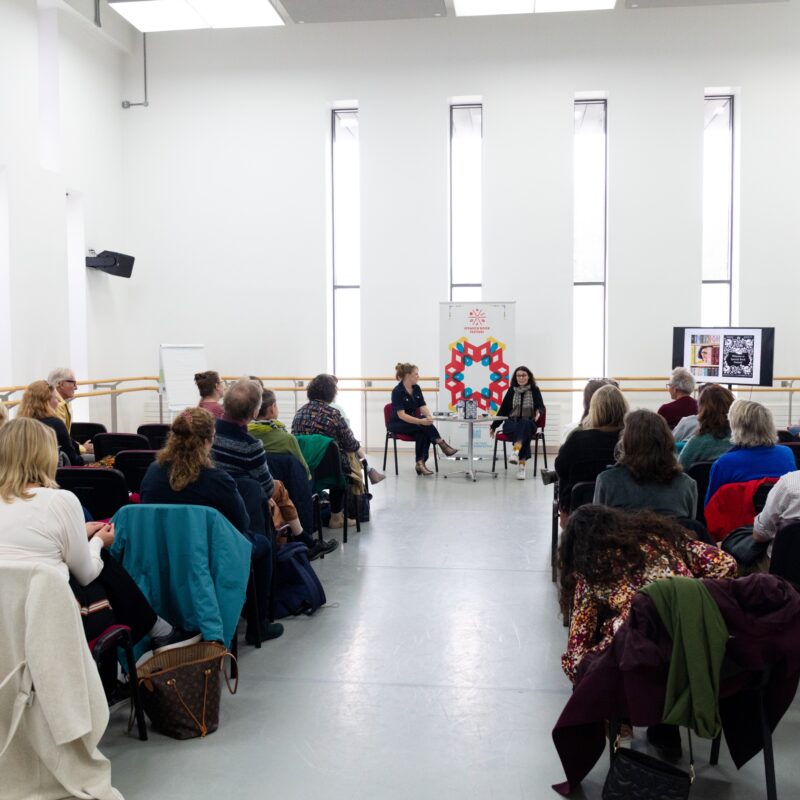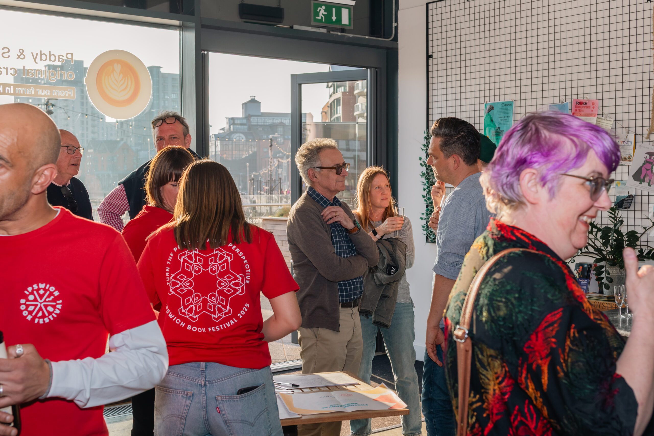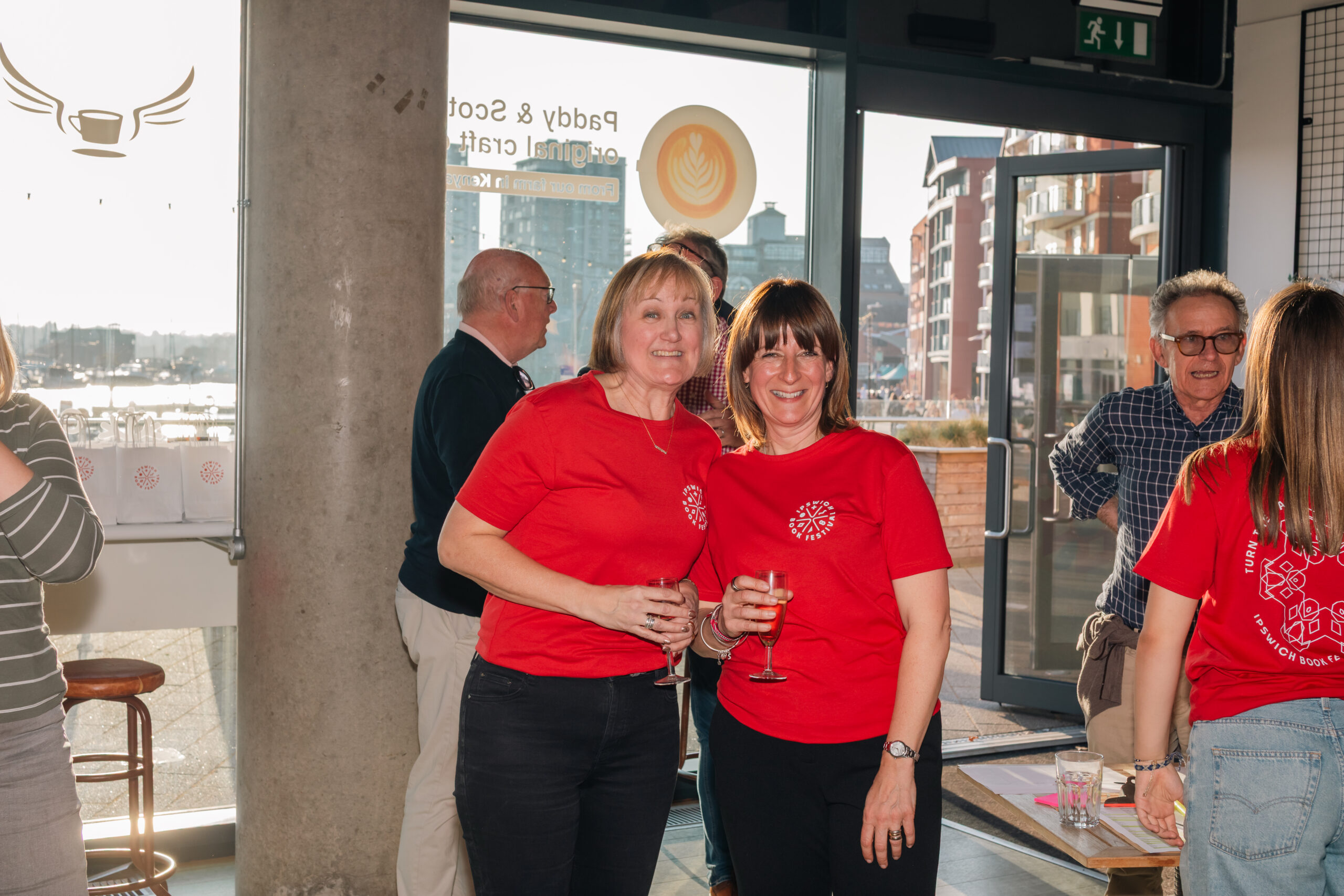
Ipswich Book Festival
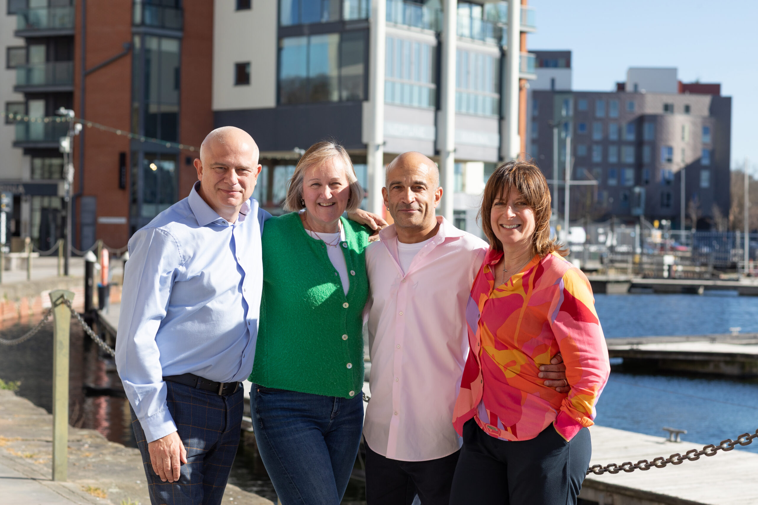
STRATEGY| BRANDING| DESIGN | CREATIVE DIRECTION | PHOTOGRAPHY | SOCIAL MEDIA
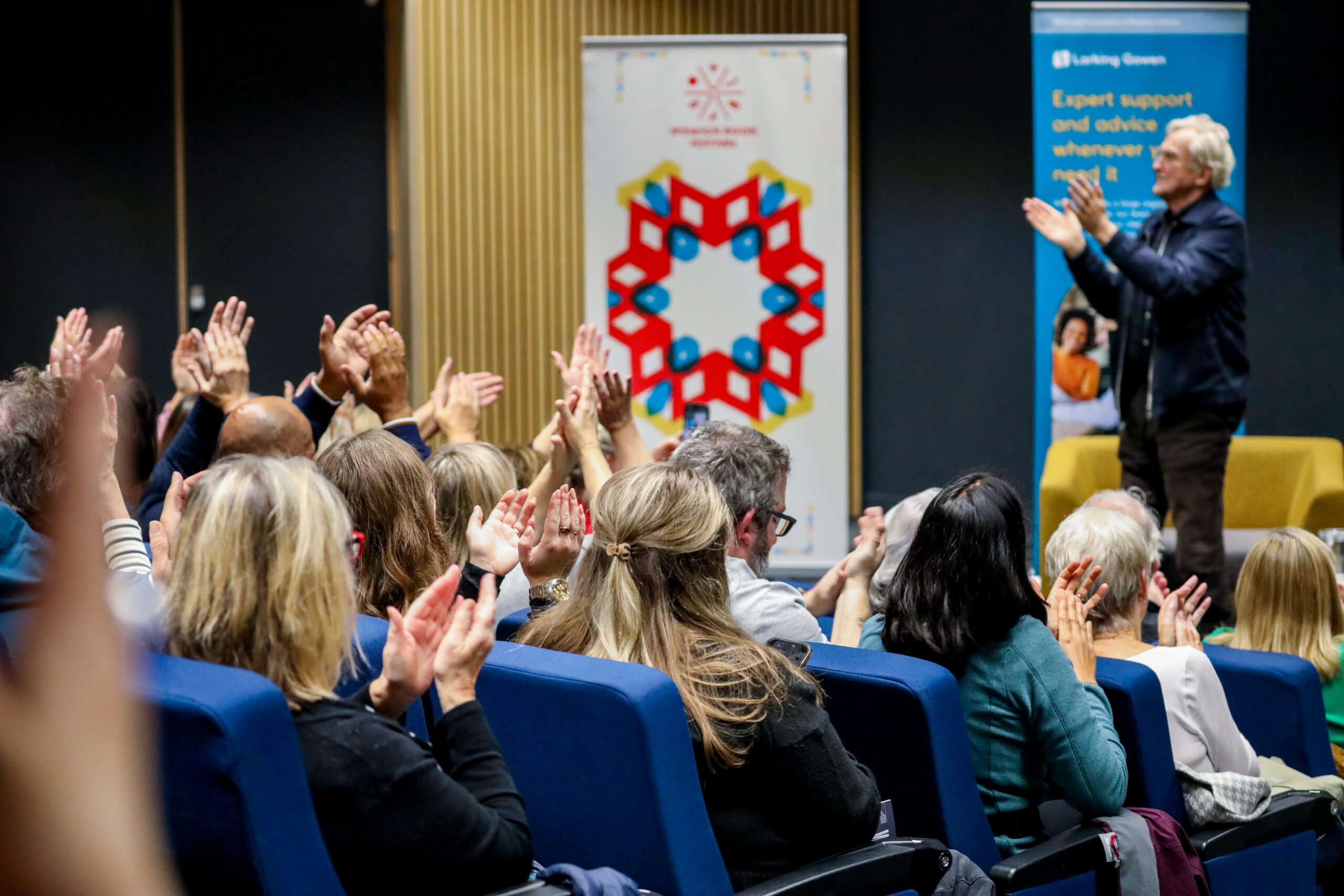
As the official creative partner for the inaugural Ipswich Book Festival, we set out to build an identity which embodied purpose, place and storytelling.
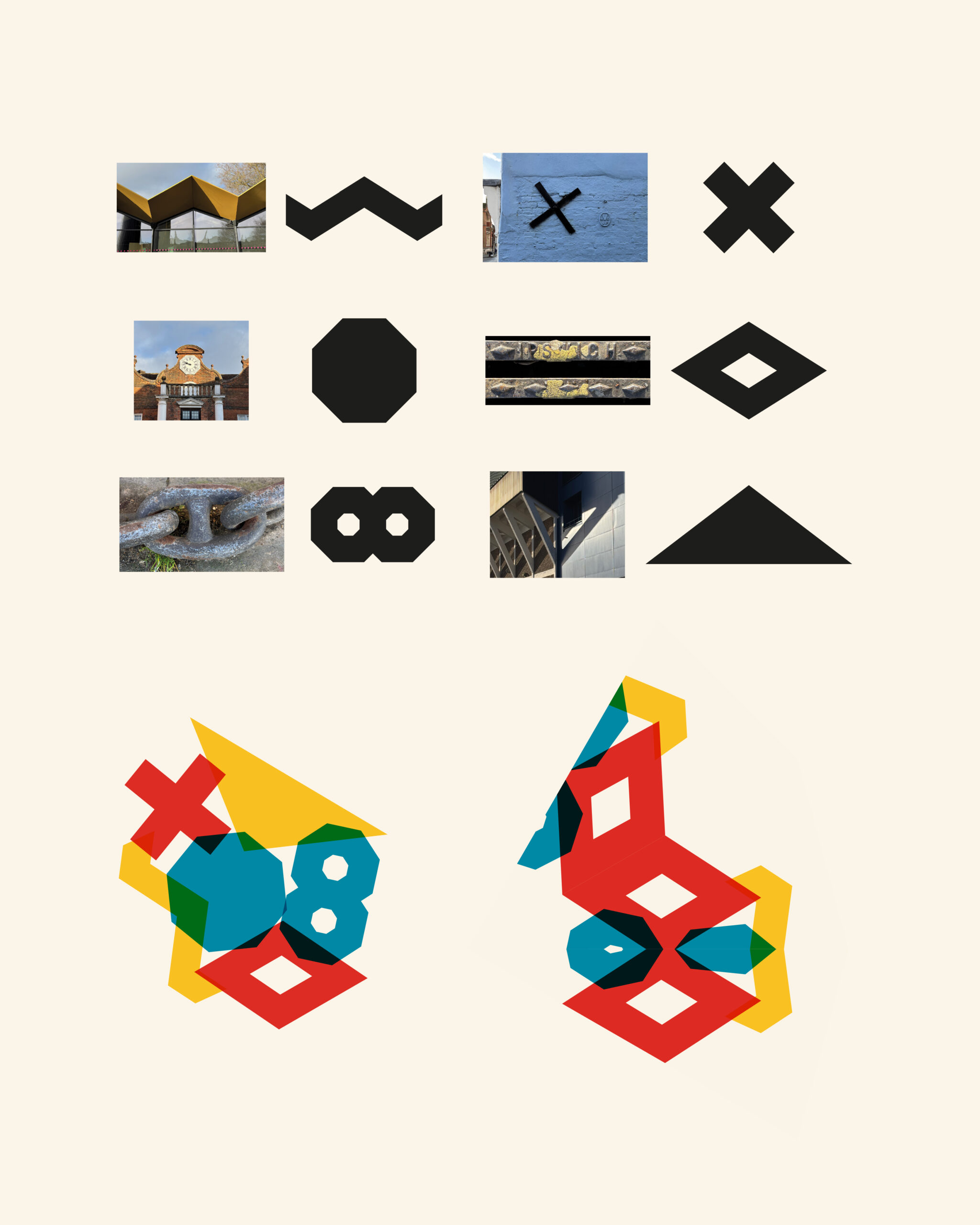
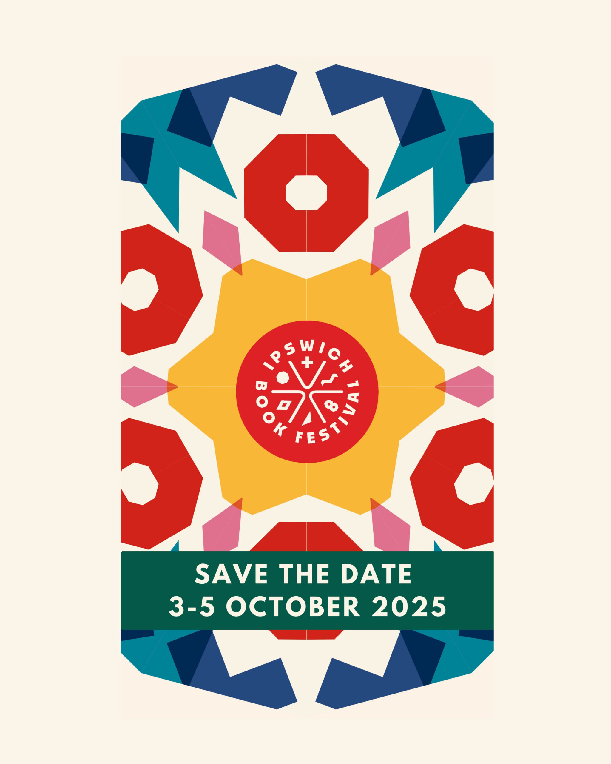
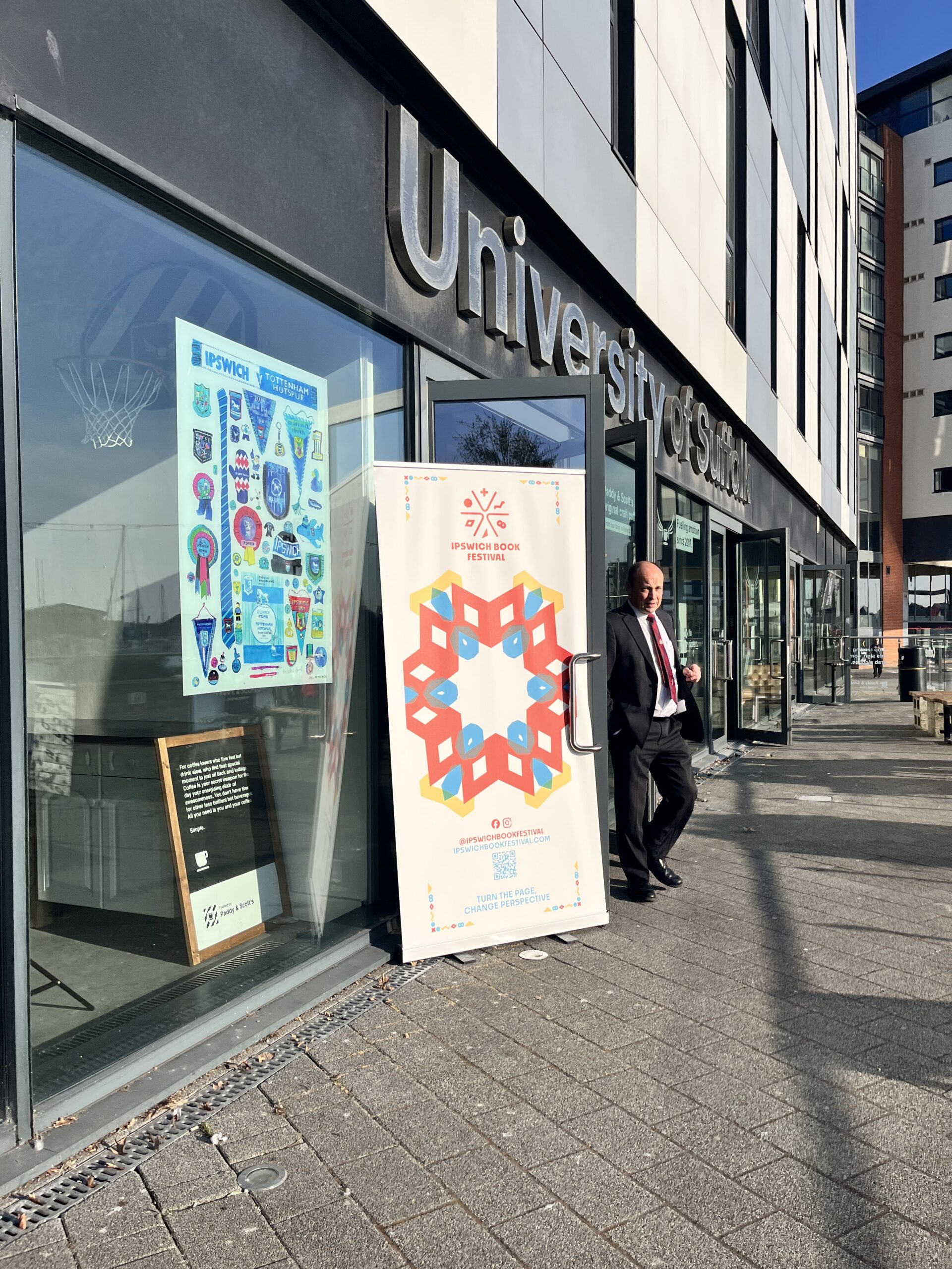
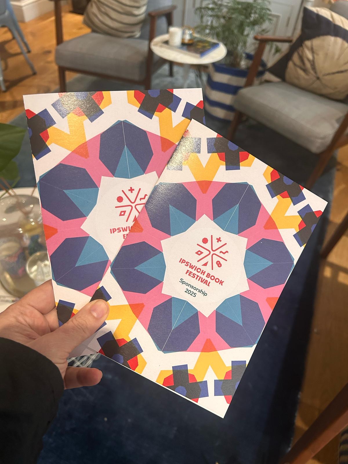
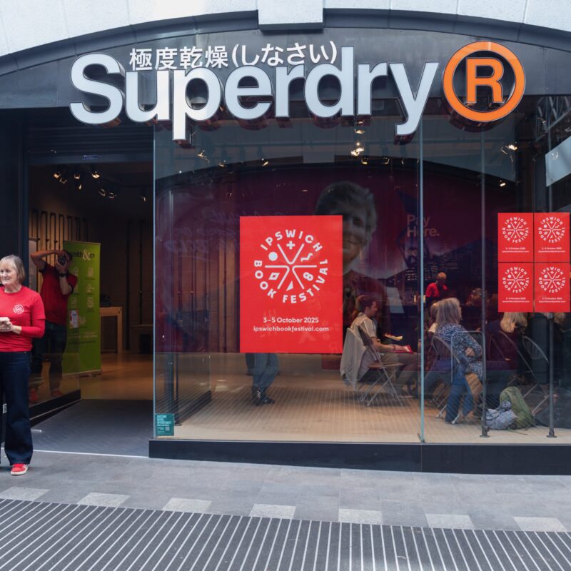
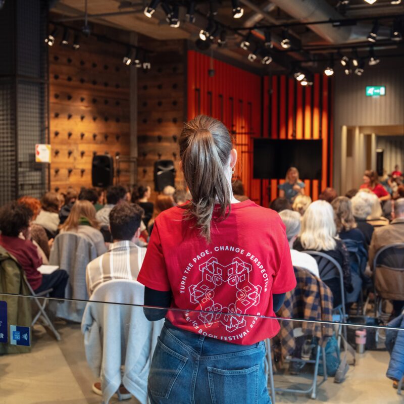
Working closely with the volunteer-led team, we helped define their values and purpose, laying a strong strategic foundation. Our discovery phase involved researching book festivals both locally and globally to ensure Ipswich could stand out with a unique, resonant concept. The Kaleidoscope concept celebrates the transformative power of stories. Books shift meaning with each reader, just as a kaleidoscope refracts light into endless new patterns. This metaphor inspired a bold, geometric logo featuring open-book elements that form a dynamic mark, paired with strong typography and a confident red to ensure visual impact. Icons inspired by Ipswich’s architecture represent six literary genres, forming the kaleidoscope’s vibrant segments. Colour is always an important consideration for us. Drawing inspiration from Ipswich’s own Liquidambar tree in Christchurch Park, we developed a vibrant, autumnal palette to reflect the festival’s October timing, symbolising transformation and creative energy. It’s on fire (red!) in Autumn.
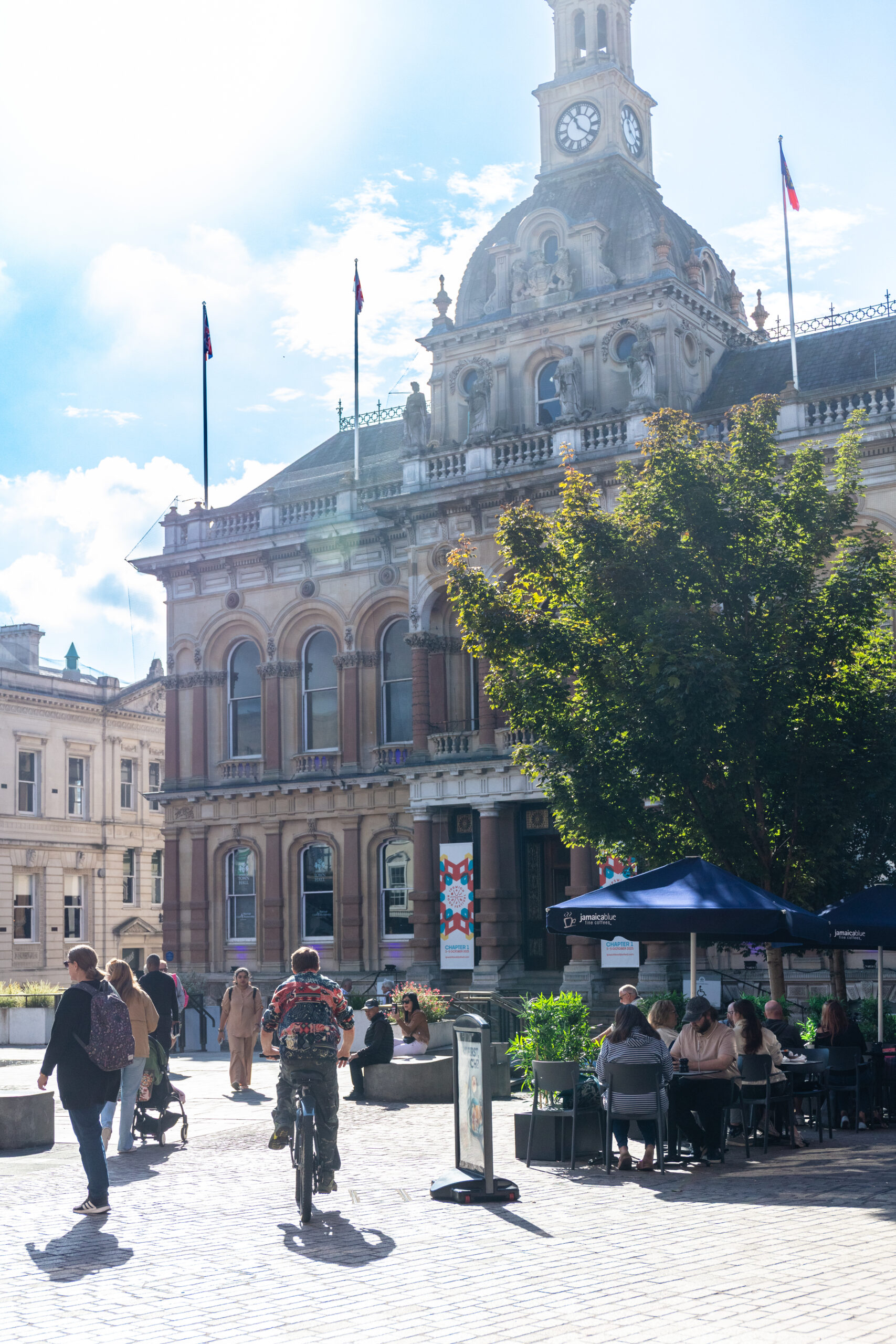
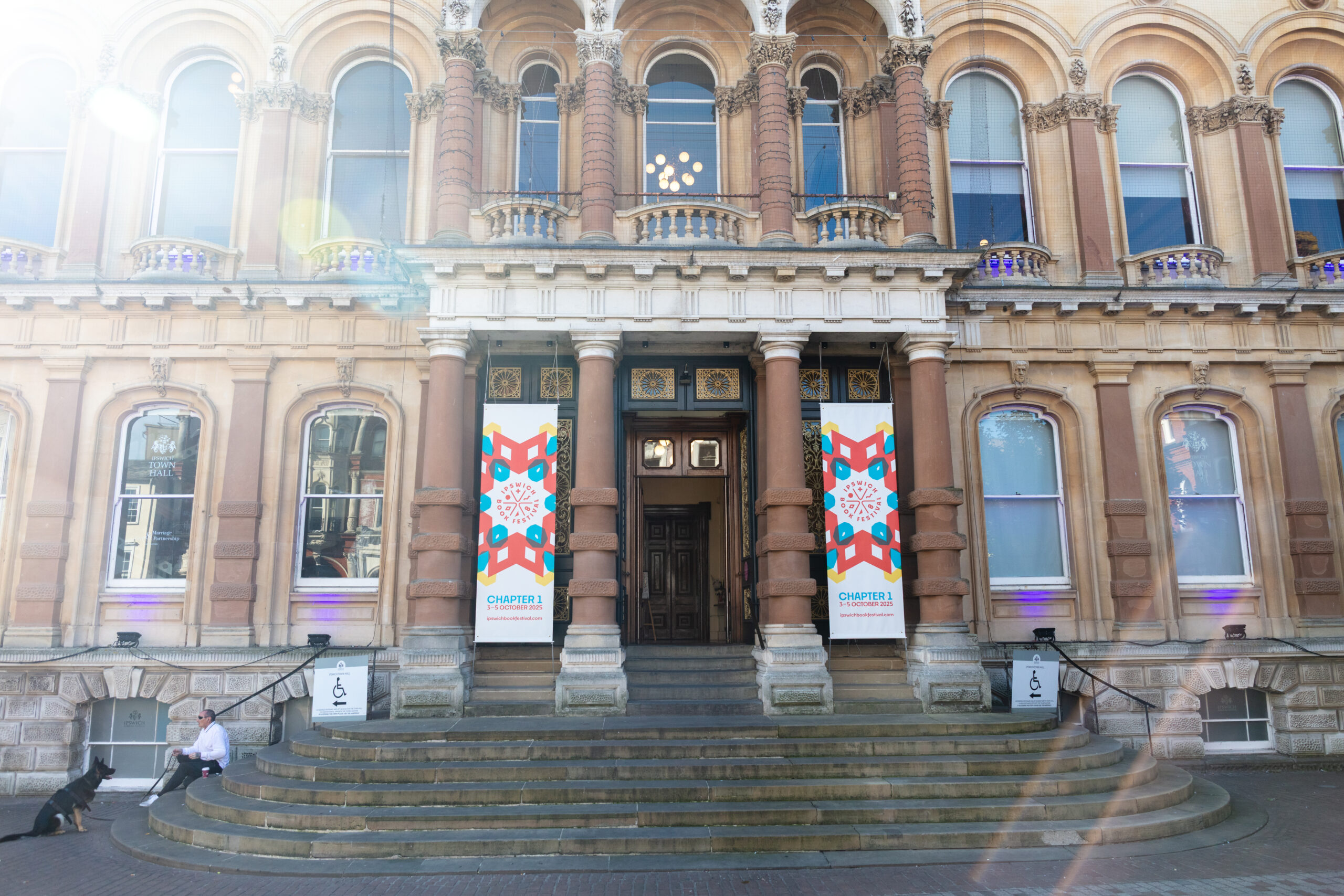
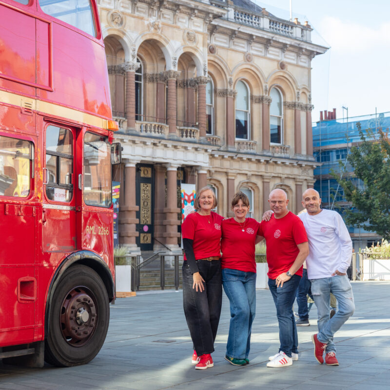
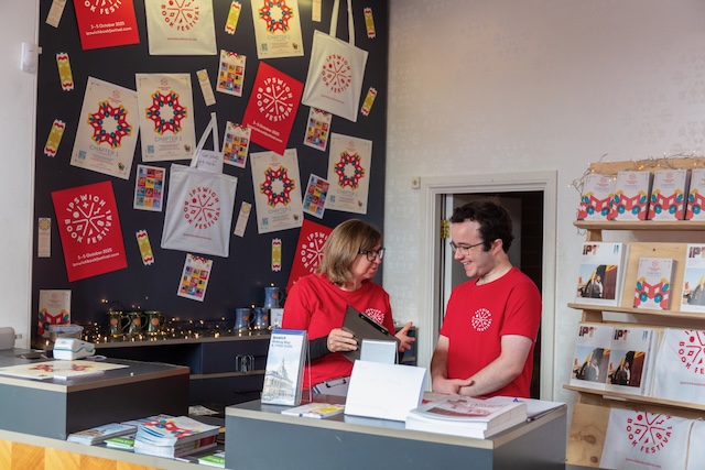
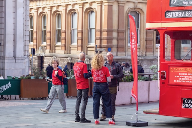
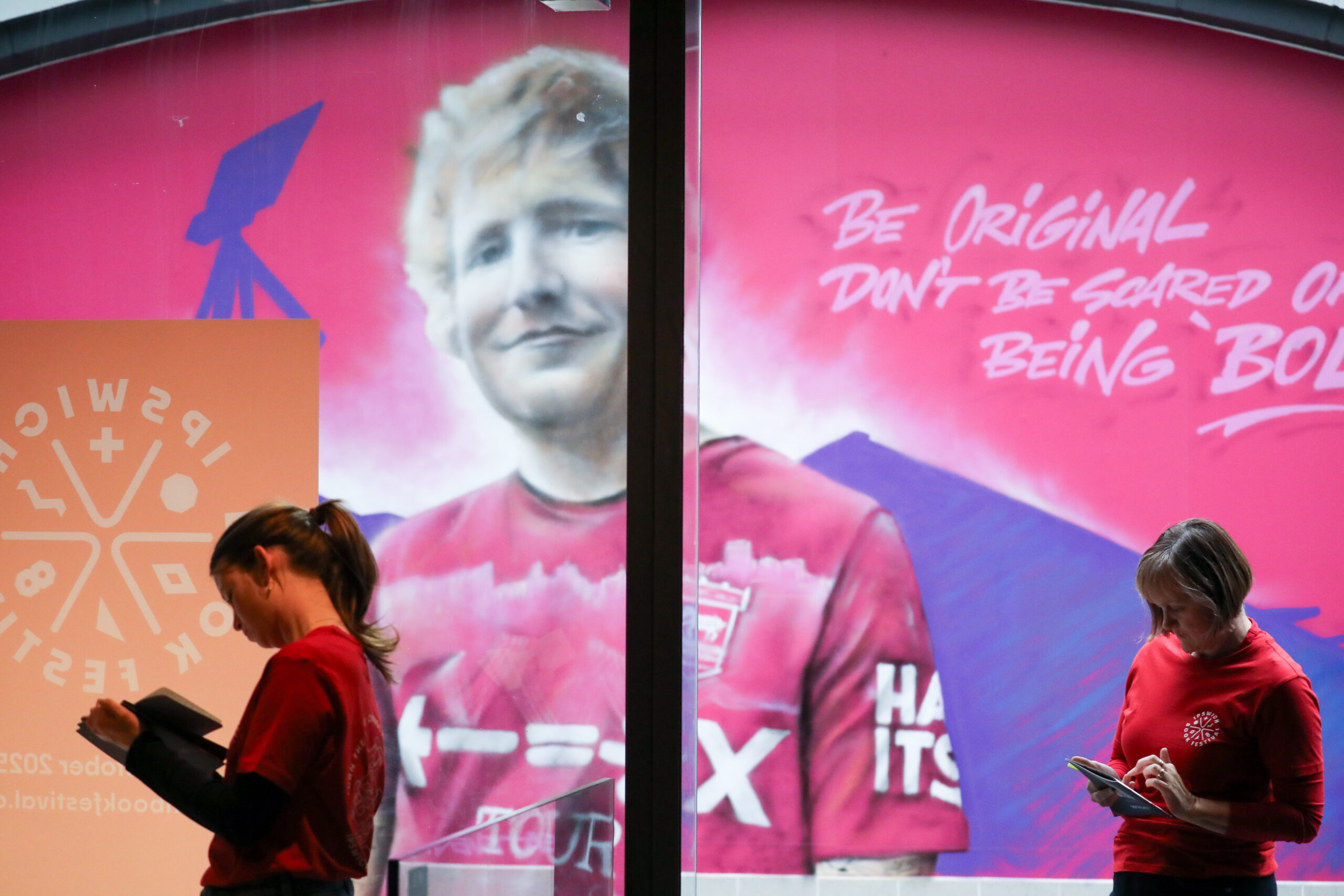
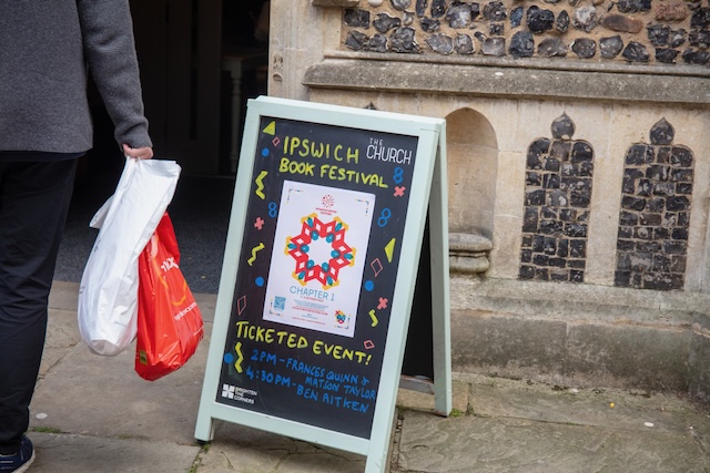
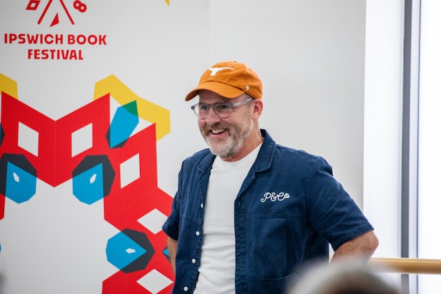
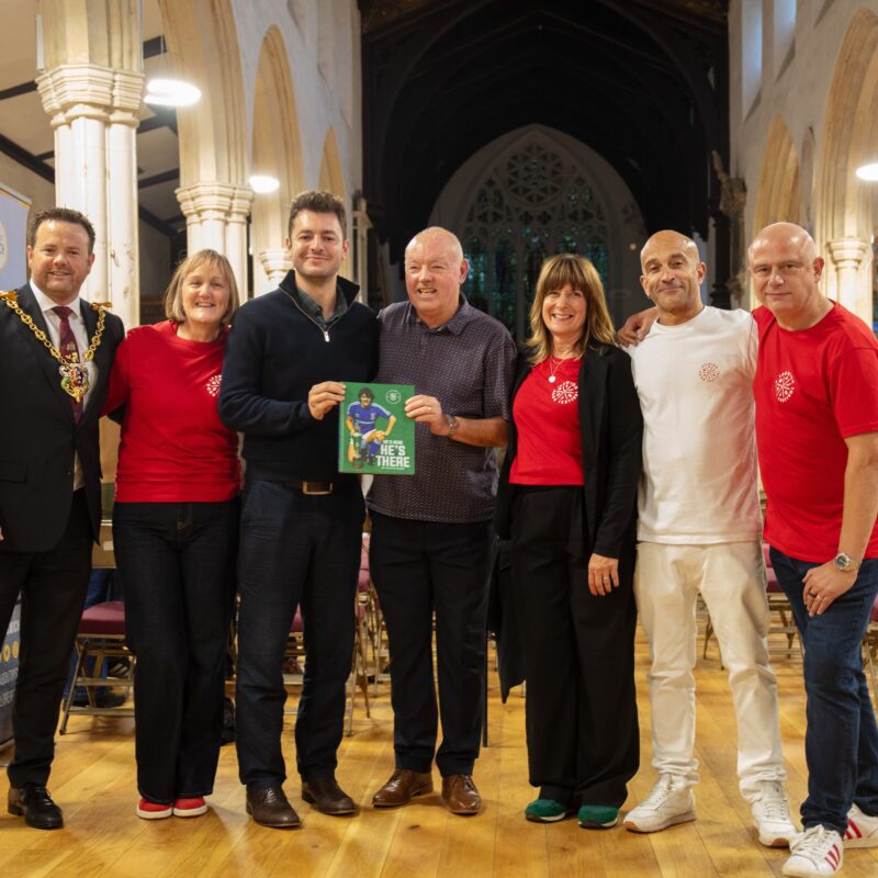
The first-year theme, Chapter 1, highlights the beginning of stories, careers and the book festival in Ipswich. As a local agency, Ipswich is our home, and this has been a true passion project. Beyond the identity, we’re also delivering social media strategy, content design, promotional materials, advertising, event design, and the official programme. Our goal is to support the festival’s launch and provide the support they need to host an exciting and impactful festival.