Suffolk County Council
BRAND STRATEGY | IDENTITY DESIGN
The Suffolk Climate Change Partnership commissioned us to develop a brand identity for the Suffolk Community Energy Network, a new hub supporting local groups driving grassroots energy and climate initiatives.
Our goal was to create a brand that inspires trust, optimism and action, without leaning on clichéd ‘eco’ visuals. We began with a strategic discovery phase, engaging stakeholders and researching comparable networks to ensure the brand reflected both Suffolk’s character and the network’s long-term mission.
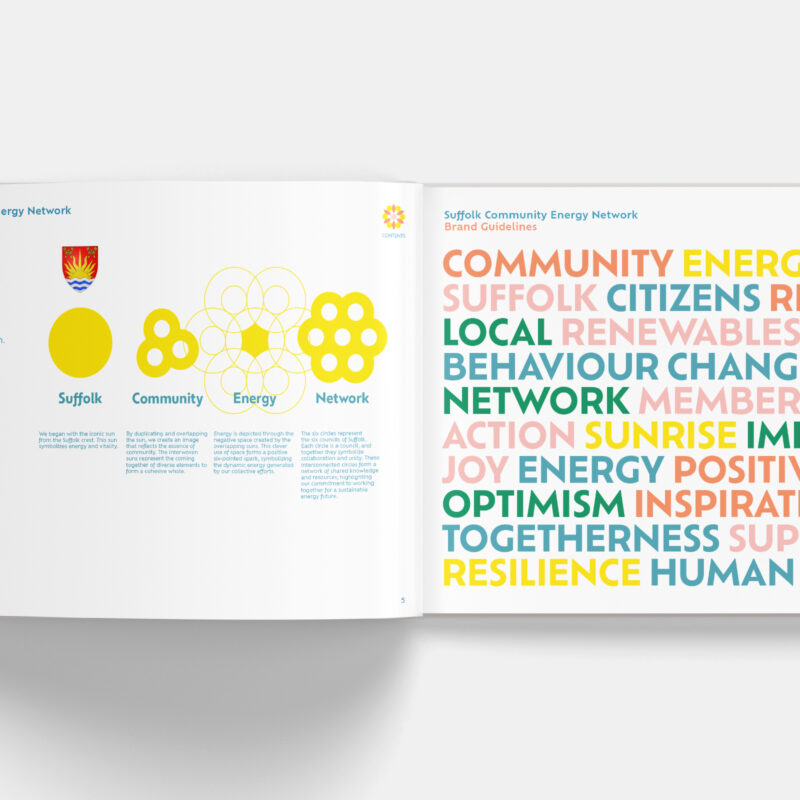
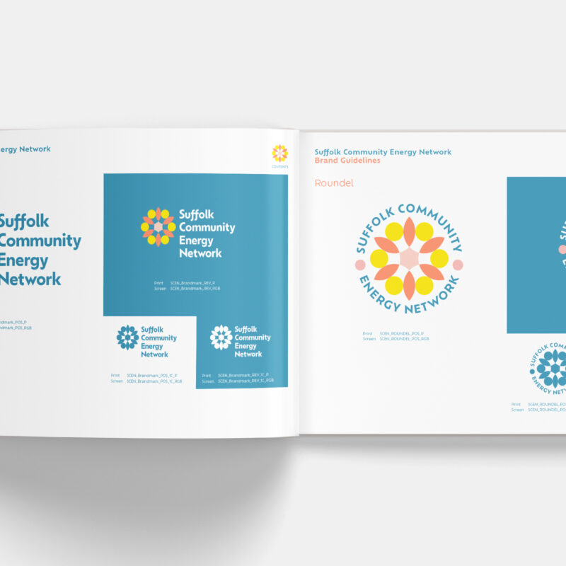
The result is a circular brandmark inspired by the Suffolk crest’s sun, reimagined as a flower to represent energy, growth, collaboration and sustainability. Each shape within the logo symbolises a key element: community, renewable energy and unity across Suffolk’s six local authorities.
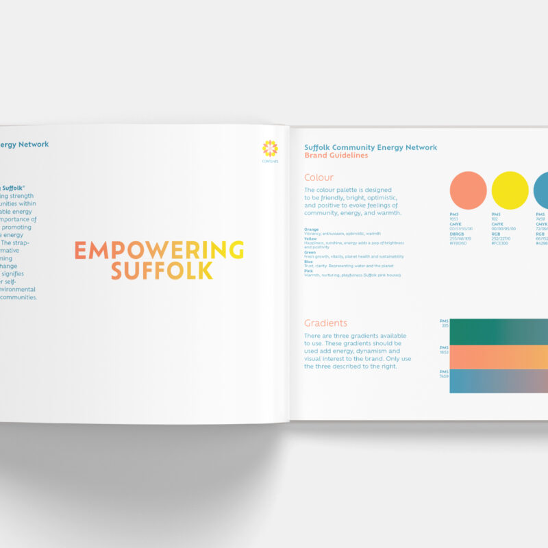
The identity uses a bright, optimistic colour palette and a friendly geometric typeface, designed to feel modern, inclusive and action-oriented. The strapline “Empowering Suffolk” expresses the brand’s purpose: to strengthen communities through sustainable energy.
This brand gives the network a strong, flexible visual foundation, ready to inspire local engagement and amplify the region’s response to climate change.